Print Design
One thing I am very passionate about is creating magazine layouts and other print materials.
"Focus Forward" for Geyer Springs Baptist Church in Benton, AR.
This magazine layout is inspired by the style of Cosmopolitan online. For my Typography class, Fall 2019, we were tasked with creating a magazine layout over any topic that interested us. The parameters were that the spread had to be four pages, have a title spread that was constructed of mainly type, and our article must have a side-bar on one page. I have a passion for politics, and wanted to create a spread that helped non-politically savvy teens navigate the contested race. I tried to keep the content as neutral as possible, while still evaluating candidates for informational purposes. I wanted to nod toward the traditional red/white/blue color scheme, while making it fresh for a younger audience.
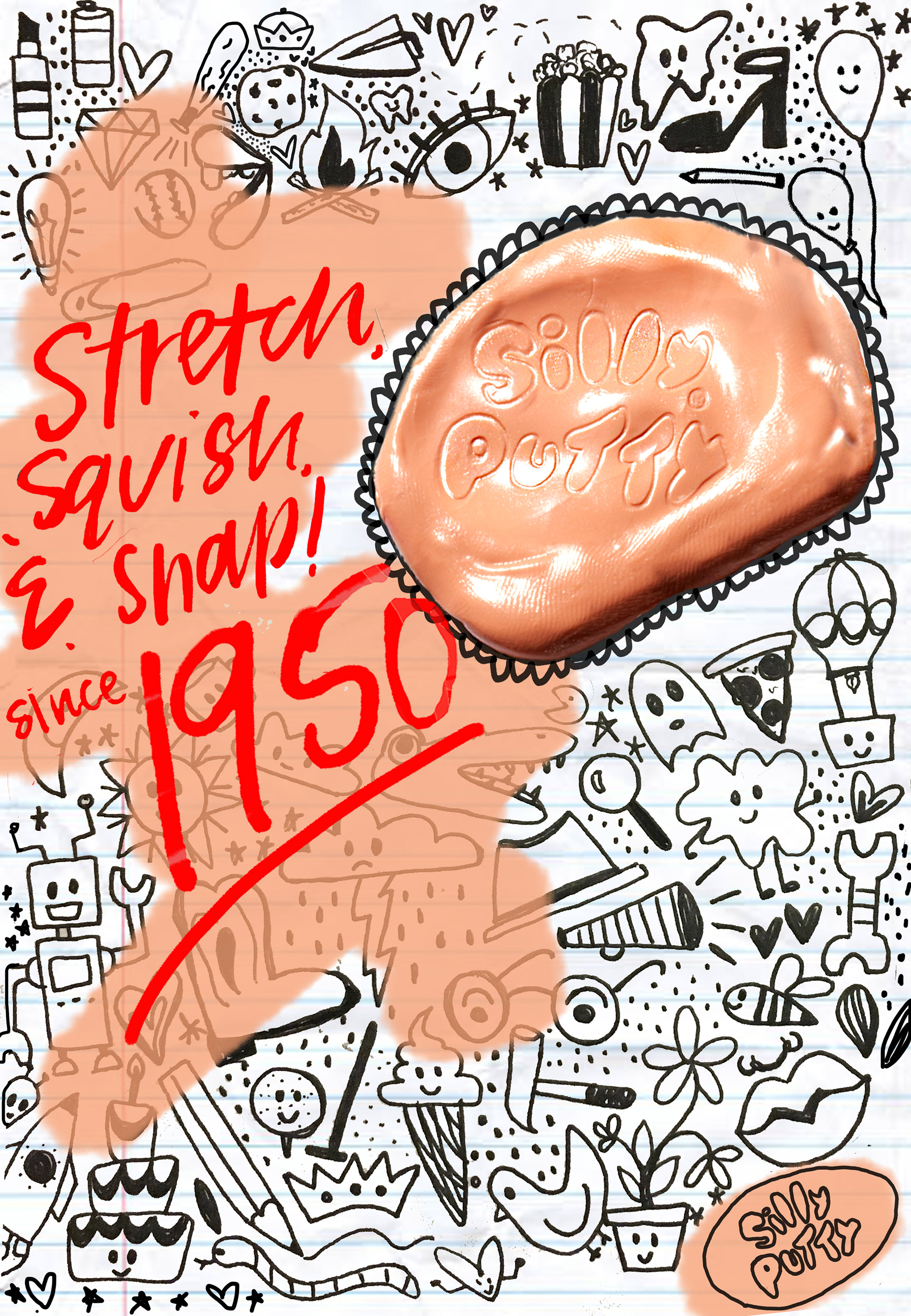
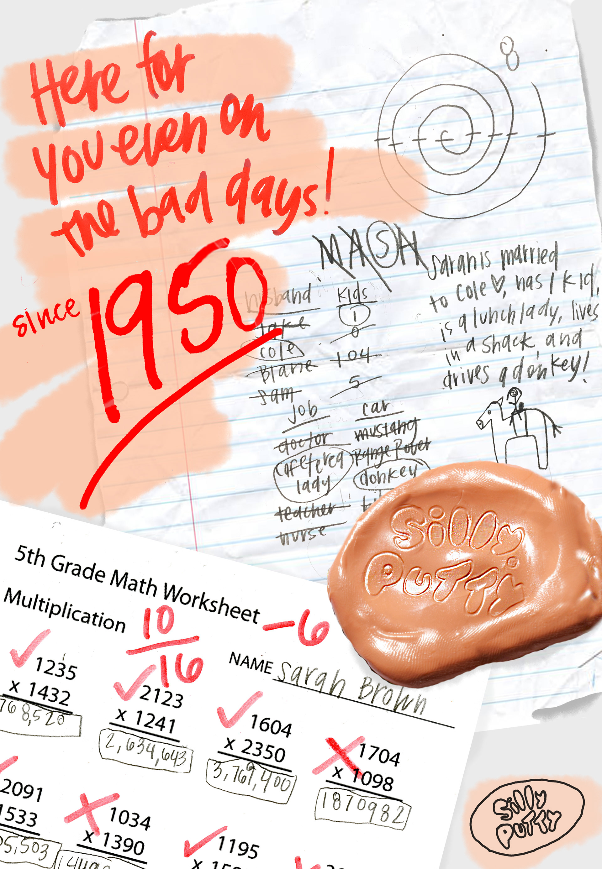
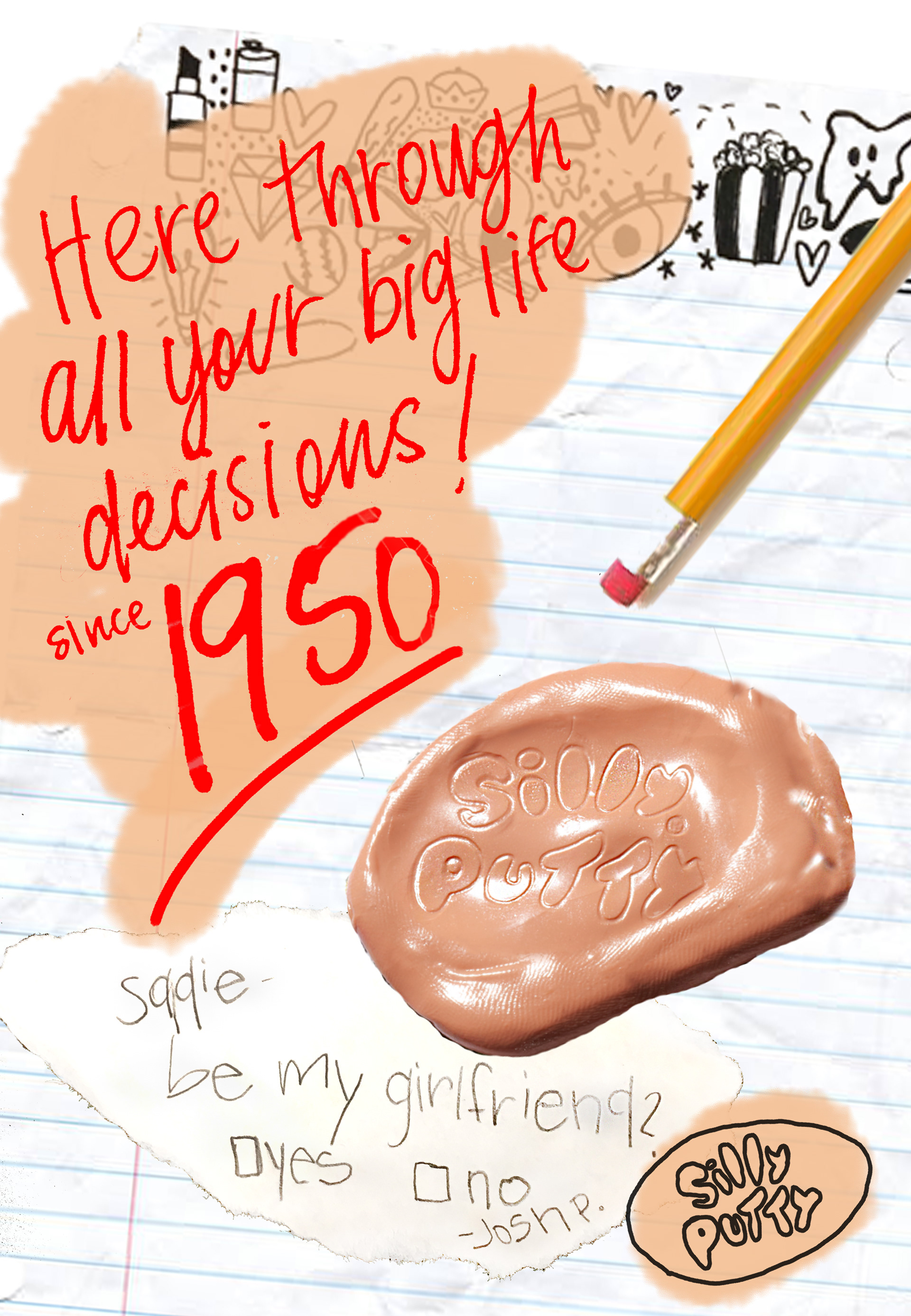
This Silly Putty Ad Campaign aims to evoke nostalgic feelings in its intended audience. The ads would appear in magazines so the contrast of the hand drawn look would stand out from the other pages.
This project was for my Graphic Design II class, Fall 2019. We were tasked with creating a tri-fold brochure for an art museum of our choosing. We then could create an exhibit or focus for the pamphlet.
I have always adored "Washington Crossing the Delaware" by Emanuel Leutze, which is famously housed at the Met. When doing more research on the painting, I realized for the first time just how beautiful the frame itself was. So for my brochure, I desired to create recognition the the frame was artwork on its own. I accomplished this by using a minimalistic design process, intentional cropping of the photos, and utilizing the iconic "Met red."
I have included a video of the brochure as well, to view the engaging way that the folds would open.
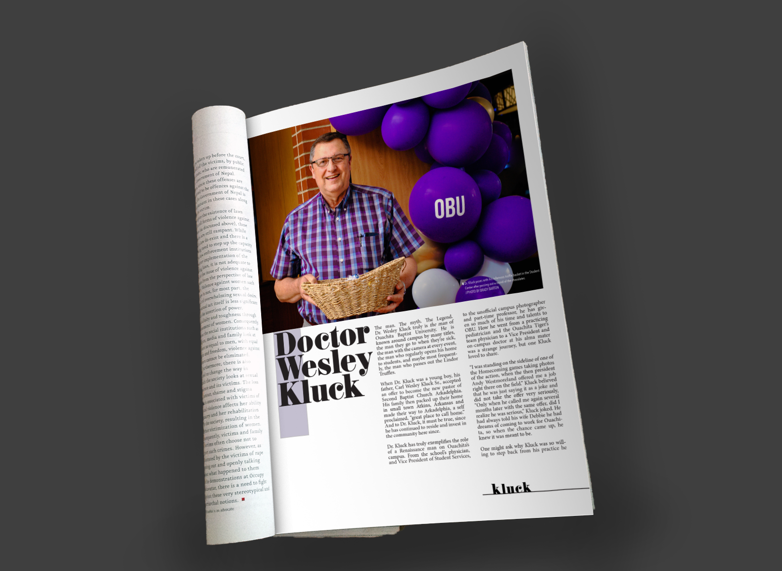
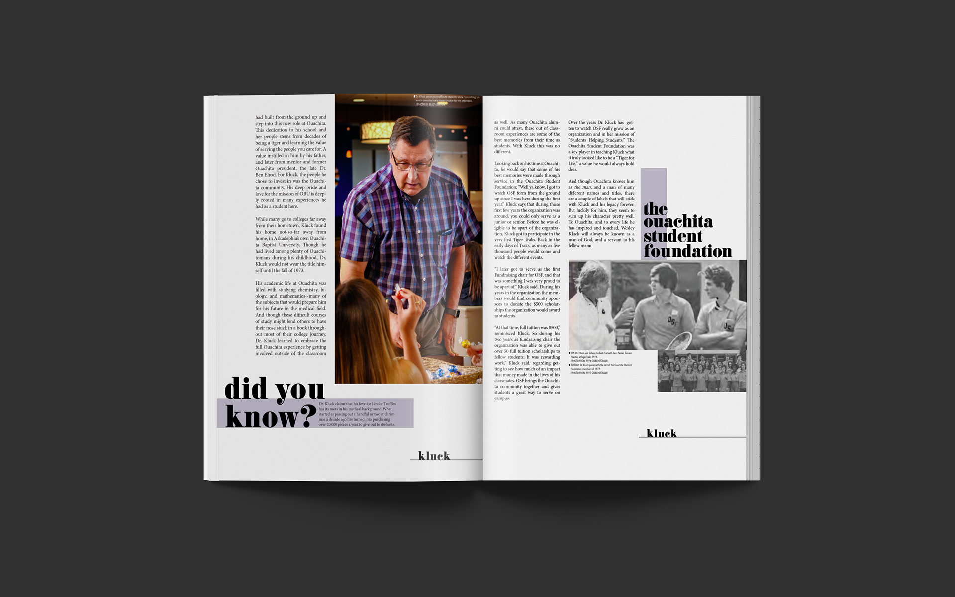
This alumni article was a project I was able to work up as a pitch for an alumni newsletter feature. The piece highlights Dr. Wesley Kluck, a Ouachita Alumnus, current Vice President, and University Physician. He is a “do it all” kind of fellow. For the spotlight, I interviewed Dr. Kluck and snapped photos of him giving out his infamous “Thursday Truffles” in the Student Center. I enjoyed getting to play several roles in the production of this work: copywriter, photographer, designer, and editor. It was fun to be able to have total creative freedom over the piece, and I would love to create more spreads like this in the future.
For the project in Graphic Design II, we were tasked with creating a two page "how to" magazine spread. I wanted to write my own story, so I decided to do it over something that is very important to our University culture--Tiger Tunes.
Tiger Tunes is an all-campus sing that brings together over 700 students each year to raise money for student scholarships. This is a very joyful time on campus, but also a very stressful time; therefore, I wanted my article to be light-hearted and a bit funny. While still giving actual tips for "Surviving Tunes Week."
This was a mockup of what could be a Time Magazine cover. It would be promoting the magazine's coverage of the election cycle. The concept behind it centers on the now iconic MAGA hat from the 2016 election. The poster is essentially asking "Who will win in 2020?" It is not partisan to one side or the other, but is just advertising the coverage of the election cycle. It was created to be a cover for early in the 2019 cycle of the Presidential race.
